Creating executive-level PowerPoint templates is more than just picking a sleek design and inserting logos. At the highest levels of business communication, expectations for clarity, professionalism, and strategic visual presentation are significantly elevated. Executives don’t have time for cluttered slides, inconsistent branding, or presentations that lack narrative cohesion. Instead, they require slide templates that are purpose-built for decision-making, strategy discussions, and performance reviews.
This guide explores how to create truly executive-level PowerPoint presentations by focusing on structure, design consistency, usability, and strategic intent. Whether you’re designing templates for the C-suite, board meetings, or investor updates, following these best practices will elevate your work and help ensure your audience sees your presentation as credible, intelligent, and to the point.
1. Understand the Purpose of Executive Presentations
The first step in designing any presentation is understanding its objective, and this is especially true for executive-level slides. Executives are often seeking quick insights, critical data, and persuasive arguments. They’re not looking for granular detail—they want to understand what’s important, why it matters, and what needs to happen next.
Start by identifying the specific types of content the template should support:
-
Strategy reviews and business updates
-
Quarterly or annual performance reports
-
Investment pitches
-
Risk assessments
-
Market analyses
Each of these use cases has different structural and content needs. Tailoring your slides to suit the purpose ensures relevancy and usefulness at the executive level.
2. Establish a Strong, Professional Layout Framework
Professionalism is non-negotiable. Templates should reflect a clean, authoritative aesthetic that aligns with the company’s brand guidelines. At the same time, they must be functional—designed to make it easy for presenters to plug in content without disrupting the visual structure.
Here’s how to build a strong foundation:
-
Use a consistent grid system: Establish uniform margins, alignment guides, and spacing rules across all slides to maintain visual balance. This improves readability and prevents design drift when different users customize slides.
-
Limit slide types to essentials: Focus on a lean set of master slides: title slides, section dividers, content with bullets, text and image layouts, data charts, and summary/conclusion slides. Avoid excessive slide varieties, which can be confusing and hard to manage.
-
Design for scalability: Consider how the template will look across different screen sizes and aspect ratios. Opt for 16:9 widescreen format unless your organization has a specific standard.
3. Use a Refined Color Palette and Typography
An executive-level presentation demands a disciplined visual approach. Avoid bright, overly decorative colors or multiple fonts that may appear amateurish or unprofessional.
-
Color palette: Stick to a muted and limited color palette—often based on the corporate brand colors. Typically, you’ll want a primary color (for headers and highlights), a neutral background color, and one or two accent colors for data visualizations or emphasis.
-
Fonts: Choose professional, easy-to-read typefaces. Sans-serif fonts like Helvetica, Calibri, or Arial often work well. Maintain consistent font sizes and weights for headings, body text, and annotations. Make sure there’s enough contrast for accessibility.
-
Hierarchy: Create clear typographic hierarchy so that slide titles, subheadings, and body content each serve distinct purposes in visual communication.
4. Build In Data Visualization Standards
Executives rely on data to make decisions. The PowerPoint template should include pre-designed chart and graph styles that ensure consistency across presentations. These should be easy to populate with Excel data and should automatically match the visual branding.
Include templates for:
-
Bar and column charts
-
Line graphs and trend analysis
-
Pie and donut charts (used sparingly)
-
Tables for financials or comparison
-
KPIs or performance dashboards
Make sure charts are designed with clarity in mind—remove unnecessary borders, gridlines, and shadows. Labeling should be minimal but readable, and color coding must follow your theme to maintain visual harmony.
5. Keep Slides Uncluttered and Focused
In executive presentations, less is more. Don’t overload slides with text, complex graphics, or unnecessary animations. Each slide should convey a single idea or point. Stick to the “one message per slide” rule, and always ask: “If I had only 15 seconds to present this slide, what would I want my audience to see or understand?”
Practical tips include:
-
Use bullet points sparingly and keep them concise (ideally no more than five per slide).
-
Avoid dense paragraphs. If more context is needed, prepare a handout or speaker notes.
-
Use whitespace intentionally to give the content room to breathe.
-
Include callouts or icons only when they add meaning—not just for decoration.
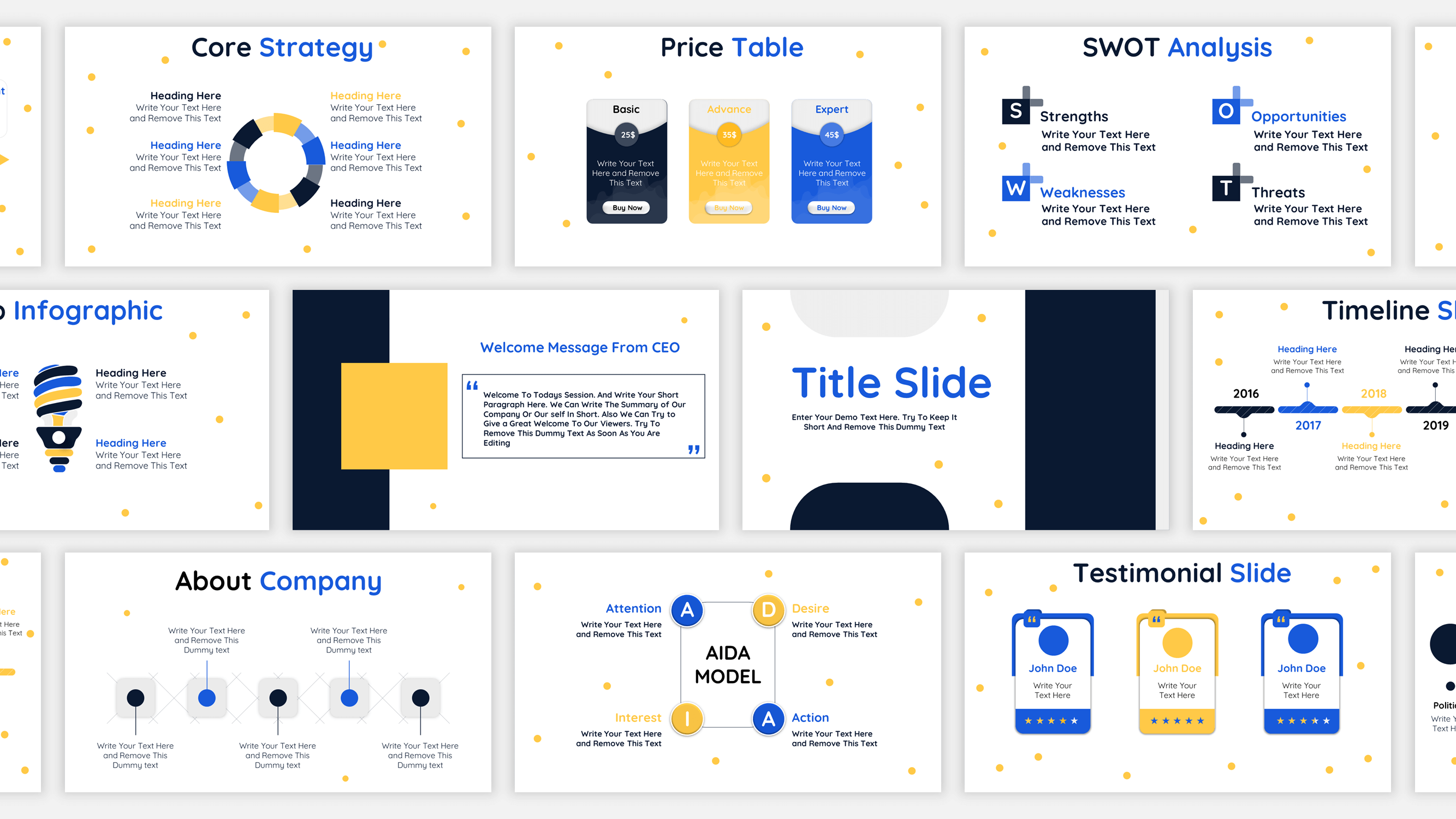
6. Incorporate Strategic Visuals and Icons
Visuals should support the message, not distract from it. At the executive level, visuals should feel purposeful and aligned with business thinking. Consider incorporating:
-
Minimalist icons to denote categories like finance, operations, or HR
-
Professional stock images that match the tone and industry context
-
Diagrams like pyramids, funnels, or flow charts to explain processes or hierarchies
-
Business frameworks like SWOT, PESTLE, or Porter’s Five Forces in slide-ready formats
Use visuals as tools for explanation and emphasis—not as aesthetic fillers.
7. Enable Easy Customization and Modularity
Even the most well-designed template will fail if it’s not easy to use. PowerPoint users of all levels should be able to populate slides without breaking the design or causing visual inconsistencies.
To promote usability:
-
Use editable placeholders for text, charts, and images.
-
Avoid hardcoded text or images that are difficult to replace.
-
Use Slide Master views to lock in layouts and formatting where appropriate.
-
Provide pre-built icon sets, color swatches, and sample slides in a “starter pack” format.
Additionally, modular slide components—like reusable blocks for KPIs, strategy maps, or action plans—make it easier for users to assemble custom decks while preserving design integrity.
8. Think Beyond the Aesthetics
Executive presentations often form part of critical decision-making processes. Your PowerPoint template should help facilitate those decisions by guiding the presenter to use strategic messaging.
To do this effectively:
-
Include templates for storytelling: executive summary, key takeaways, roadmap, and next steps.
-
Design agenda or table of contents slides with built-in navigation for longer decks.
-
Encourage use of storytelling arcs: situation → complication → resolution or problem → solution → result.
-
Incorporate sections for “Recommendations” and “Implications,” especially for analytical or consulting presentations.
These additions help frame content not just as information but as insight, which is what executives truly value.
9. Test the Template in Real-World Conditions
Before rolling out your executive PowerPoint template across the organization, test it with real content and users. Observe how presenters interact with the slides—what works and what causes friction.
Ask questions like:
-
Are users able to quickly adapt the template to their needs?
-
Do the charts and layouts accommodate the types of data executives typically see?
-
Does the template load well on different devices or when exported to PDF?
-
Are there common requests for additional slide types?
Feedback from these tests can inform refinements that will make your template more versatile and user-friendly.
10. Maintain and Update the Template Over Time
Finally, executive templates should evolve along with the business. As branding, reporting needs, or strategic priorities shift, so too should your presentation assets.
Best practices include:
-
Version control: Assign a version number or date to help users ensure they’re using the latest file.
-
Training resources: Offer a brief guide or video walkthrough on how to use the template effectively.
-
Governance: Assign ownership of the template to a design or marketing lead responsible for updates and enforcement.
Consistent use across the organization leads to more unified and professional communication—something executives and external stakeholders will recognize and appreciate.
Conclusion
Creating an executive-level PowerPoint template isn’t just about aesthetics—it’s about enabling clarity, insight, and confidence in communication. By focusing on structured layout, visual professionalism, strategic content framing, and ease of use, your template becomes more than a design asset. It becomes a communication tool that empowers leadership to present ideas clearly, drive decisions, and showcase the organization’s credibility.
A well-crafted PowerPoint template can set the tone for a high-stakes meeting, align your team’s efforts, or even sway investor opinions. It’s worth taking the time to get it right—because at the executive level, every slide counts.